


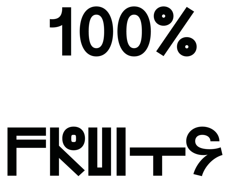
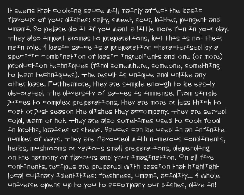
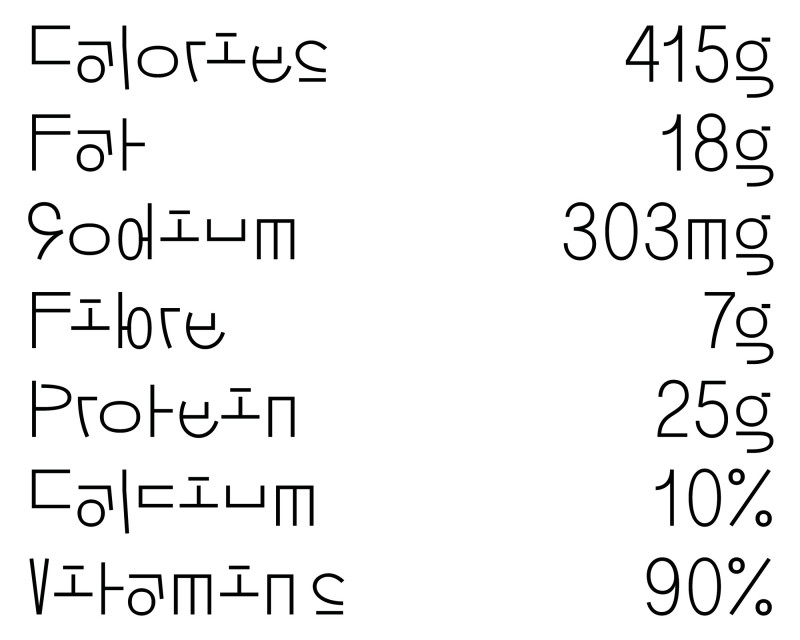
No-ko is a display typeface designed by Loris Pernoux.
With an Asian feel and composed solely of Latin glyphs, No-ko finds its inspiration in the crossbreeding of different Asian languages and draws on the poetry of their graphic forms. Avoiding folkloric amalgams, No-ko aims to be radical and singular by reinterpreting some of their common essentials, such as meeting of curves, crossed lines, the height of symbols or pattern repetition, while blending in with an Occidental reading. It plays with baseline variations to give rhythm to the composition of the words and amuse the eye. As a tribute, No-ko was designed in a spirit of expressive experimentation that could graphically bridges different cultures with fun and love.
Loris Pernoux
Desktop, Web
OpenType, WOFF, WOFF2
Light, Regular, Bold, Black
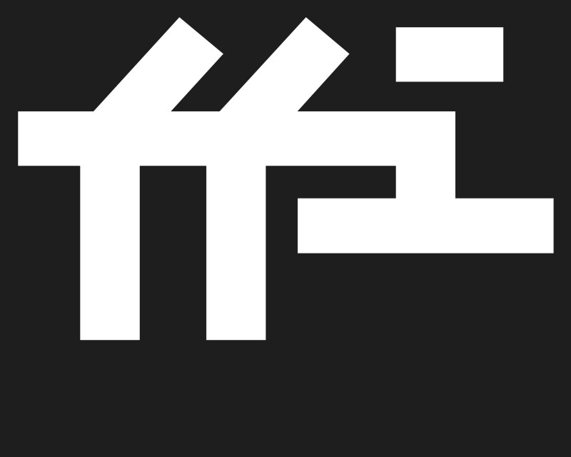
Standard Ligatures
Discretionary ligatures
Fractions
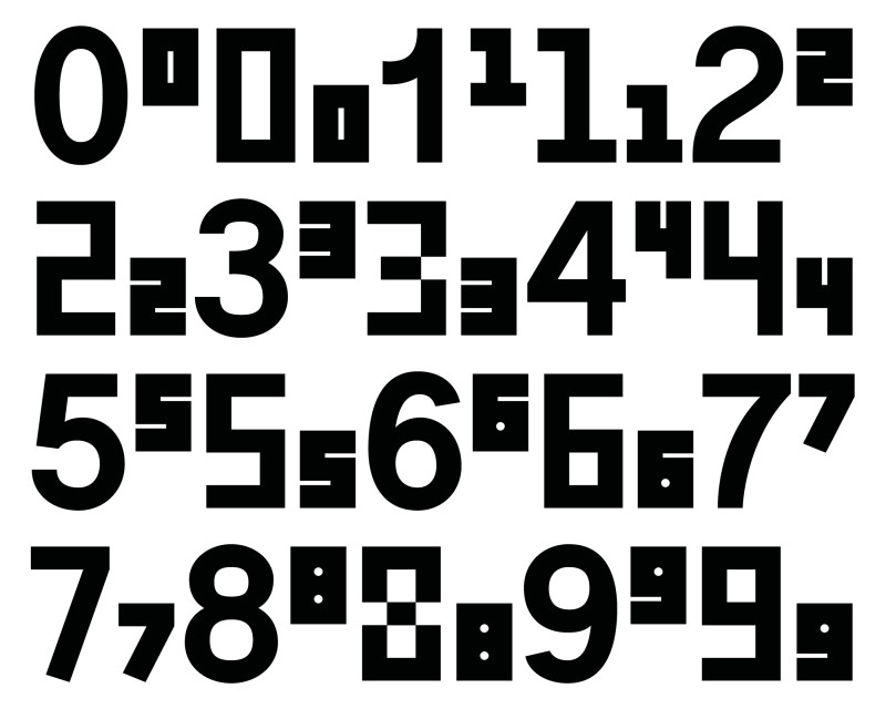
Superscript Numbers/Letters
Subscript Numbers
Stylistic Sets (SS01-SS06)
No-ko is a display typeface designed by Loris Pernoux.
With an Asian feel and composed solely of Latin glyphs, No-ko finds its inspiration in the crossbreeding of different Asian languages and draws on the poetry of their graphic forms. Avoiding folkloric amalgams, No-ko aims to be radical and singular by reinterpreting some of their common essentials, such as meeting of curves, crossed lines, the height of symbols or pattern repetition, while blending in with an Occidental reading. It plays with baseline variations to give rhythm to the composition of the words and amuse the eye. As a tribute, No-ko was designed in a spirit of expressive experimentation that could graphically bridges different cultures with fun and love.
→ Exclusively available at lorispernoux.fr
Loris Pernoux
Desktop, Web
OpenType, WOFF, WOFF2
Light, Regular, Bold, Black
Standard Ligatures
Discretionary ligatures
Fractions
Superscript Numbers/Letters
Subscript Numbers
Stylistic Sets (SS01-SS06)